Landing Page vs Website: Which One Does Your Ad Campaign Actually Need?
You can have a strong advertisement, the right audience and a competitive offer, but still lose potential leads after they click.
One common reason is simple: the visitor is being sent to the wrong page.
Many businesses running Meta Ads, TikTok Ads or Google Ads send every campaign directly to their company homepage. The website may look professional, but a general homepage usually has several different messages, services, navigation options and calls-to-action competing for attention.
That is useful when someone wants to explore your company. It is not always ideal when someone has just clicked an advertisement for one specific product, service or promotion.
Landing Page vs Website: What Is the Actual Difference?
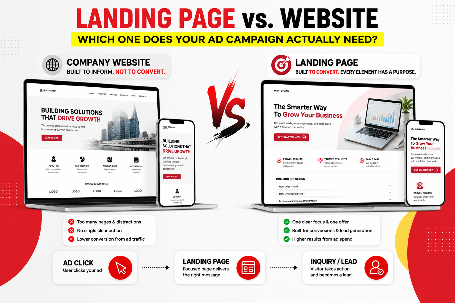
A website and a landing page are both important digital assets, but they are designed for different jobs.
A corporate or business website usually needs to explain the overall company. Visitors may want to understand your services, portfolio, background, contact details or credibility before deciding what to do next.
A campaign landing page is much more focused. It is normally built around one audience, one offer and one primary conversion goal.
BUILT TO INFORM & BUILD TRUST
- Multiple services or products
- Navigation menu
- About the company
- Portfolio or case studies
- Several possible visitor journeys
- Long-term brand credibility
BUILT TO DRIVE ONE ACTION
- One campaign or offer
- Focused message
- Minimal distractions
- Clear conversion journey
- Direct inquiry or purchase CTA
- Designed for paid traffic
Neither option is automatically better. The right choice depends on what the visitor is trying to do and where that visitor came from.
Why Sending Paid Ad Traffic to a Generic Homepage Can Waste Opportunities
Imagine someone sees a Meta advertisement promoting one specific service.
The advertisement promises:
The visitor clicks the advertisement expecting to learn more about that offer.
Instead, they arrive on your homepage and see:
- A general company introduction
- Five different services
- A portfolio
- About Us
- Several navigation links
- Different calls-to-action
Now the visitor has to search for the information that convinced them to click in the first place.
Every additional decision introduces friction.
When ad messaging and landing-page messaging feel disconnected, potential customers may leave before understanding the offer.
When Should You Use Your Main Website?
A company website still plays an important role in your marketing strategy.
It is particularly useful when visitors need to explore the business before making a decision.
Your main website may be the better destination when:
- You offer several products or services
- The visitor is researching your company
- You want to showcase a large portfolio
- Trust and corporate credibility are important
- Your traffic comes from branded search or referrals
- The customer journey naturally requires more exploration
Think of the website as your digital headquarters.
It gives customers the broader picture of who you are, what you do and why they should trust the business.
When Does Your Campaign Need a Dedicated Landing Page?
A landing page becomes especially useful when your advertisement has one clear objective.
For example:
- Generate WhatsApp enquiries
- Collect lead-form submissions
- Book consultations
- Promote one product
- Launch a limited-time campaign
- Register people for an event
- Request quotations
- Capture webinar registrations
Instead of asking visitors to explore an entire website, the landing page guides them through one focused journey.
The visitor responds to one specific message.
The page continues the same offer and explains why it matters.
A clear CTA makes the next step simple.
What Should a High-Converting Landing Page Include?
A landing page does not need dozens of complicated sections.
It needs enough information to help the visitor understand the offer, trust the business and take the next step.
1. A Clear Headline
The first screen should immediately tell visitors what the offer is and why it is relevant to them.
Avoid vague statements such as:
“We provide high-quality solutions for your business.”
“Reduce Factory Heat with an Industrial Ventilation System Designed for Large Spaces.”
Specific messaging makes it easier for visitors to understand whether the page is relevant to them.
2. A Strong Visual or Video Hero
Visual communication can help visitors understand a product or service faster than large blocks of text.
Depending on the campaign, the hero section could include:
- A product demonstration
- A short commercial video
- An installation or project showcase
- Before-and-after visuals
- A spokesperson explaining the offer
- A strong product photograph
The goal is not to add video simply because video looks impressive. The visual should help communicate the offer faster.
3. Clear Benefits, Not Just Features
Businesses often fill landing pages with technical specifications but forget to explain why those specifications matter.
A useful structure is:
For example, instead of only saying: “2-year warranty,” explain how the warranty reduces risk and gives the buyer greater confidence.
4. Proof & Credibility
Visitors coming from advertisements may be discovering your brand for the first time.
Give them reasons to trust you.
- Client logos
- Testimonials
- Case studies
- Completed projects
- Years of experience
- Certifications or warranties
- Real product or team photography
5. Transparent FAQs
Frequently asked questions are not just additional content. They can remove common objections before the visitor contacts you.
Useful questions might cover:
- Pricing or starting budget
- Turnaround time
- Delivery or service areas
- What is included
- Warranty
- How the process works
6. A Friction-Free Enquiry Form
Asking for too much information can create unnecessary friction.
If the goal is to start a conversation, you may only need:
- Name
- Company
- Phone or WhatsApp
- Service needed
- Short project description
The form should feel easy enough to complete on a phone.
Mobile Landing Page Design Is Not Optional
A large percentage of traffic from Meta, Instagram, TikTok and other social advertising platforms arrives from mobile devices.
That means a landing page that looks excellent on desktop can still lose leads if the mobile version is difficult to use.
Mobile landing pages should prioritise:
- Readable text without zooming
- Large, easy-to-tap CTA buttons
- Short forms
- Clear spacing between sections
- Compressed images and videos
- Simple navigation
- Fast access to WhatsApp or enquiry forms
Page Speed Can Affect the Lead Before the Page Even Loads
Every advertisement click costs money.
If the landing page takes too long to load, some visitors may leave before seeing your headline, offer or enquiry form.
This is why conversion-focused web design is not only about visual appearance.
Technical performance matters too.
Large images and videos should be optimised for web use.
Avoid unnecessary scripts, animations and heavy page elements.
Test the actual experience visitors get from their phones.
Match the Landing Page Message to the Advertisement
One of the simplest ways to create a smoother customer journey is to maintain message consistency.
If the advertisement says:
the landing page should immediately reinforce that same offer.
Do not make visitors wonder whether they clicked the correct link.
Do You Need a Website, a Landing Page, or Both?
For many businesses, the best answer is: both.
Your website acts as the long-term digital home of the company. It builds credibility, explains your services and gives customers somewhere to research the business.
Your landing pages support individual advertising campaigns.
Instead of forcing one homepage to handle every type of visitor, you can create focused campaign journeys for different audiences and offers.
Landing Page = Campaign & Conversion
Before Sending More Traffic, Fix What Happens After the Click
Increasing your advertising budget will not automatically solve a weak post-click experience.
Before spending more, review the destination page.
- Does the headline match the advertisement?
- Can visitors understand the offer within seconds?
- Is there one clear primary CTA?
- Are trust signals visible?
- Are common objections answered?
- Is the enquiry process simple?
- Does the page load properly on mobile?
A good paid advertising strategy does not stop when someone clicks the ad.
The advertisement, landing page and enquiry journey should work as one connected conversion system.
DON’T JUST BUY MORE CLICKS.
BUILD A BETTER JOURNEY AFTER THE CLICK.
From campaign landing pages and website design to performance creative and paid advertising, we help businesses build a clearer path from attention to enquiry.
TALK TO CLIPKER ↗